



THE 'MOST LOVED' PROJECT (MLP)
I helped reframe MYP’s fragmented funder-specific workflows into a unified service provision model, using the journey of a line item as the focal point for product architecture, user workflows and delivery planning.
Internally called our 'Most Loved' project as it focused on making the parts customers rely on most better to use, and easier for us at MYP to maintain and grow.
Please note: This is a new case study I've added recently and I'm still iterating as the initiative progresses.
Role: Senior Product Designer / Product Strategist
Credits: CPO: Matt Latin / Senior Product Manager: Zacc Thomas
Quick context before I dive into the case study details:
How government funded care works
A service provider needs to capture a participant’s details, set up their funding, plan the services they’ll receive, roster staff to deliver those services, confirm what actually happened, then invoice, claim and get paid for the work delivered.
A lot of that flow depends on something called a line item, it is the funder’s service code. It defines what can be delivered, what rules apply, how it is priced and what can be claimed.
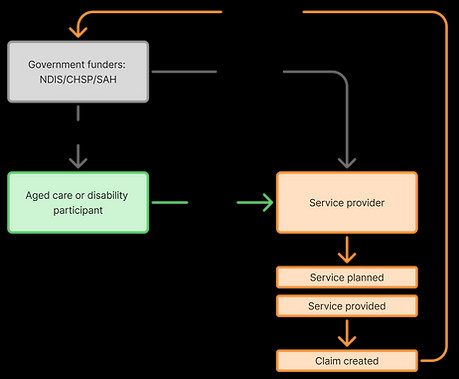

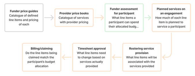
The journey of a line item
In MYP, that line item touches almost everything. It starts in a funder catalogue (eg. NDIS yearly price guide), flows into provider price books and participant service plans, then carries through rostering, timesheet approval onto payroll and billing.
The problem: A product built over time with no plan
MYP has been around for years and has solved plenty of customer problems along the way. But like a lot of older products, it was built in response to specific customer requests, funding changes or sales-led features.
Over time, useful things were added without looking at the full product journey. Funders had different workflows, features were tied into older parts of the system, and the CRM had become a catch-all for things it was never really meant to do.
The challenges
Huge chunks of tech and UX debt
-
Parts of the legacy apps play major roles in how the newer ones were built, and due to the haphazard approach to building the product, any changes to those parts of the product could break.
-
The platform was built and designed in pieces over time by many different engineers with no UX input. No one actually knew what our users needed, and decisions were made without them.

What parts of the exiting structure and workflows are salvageable?
A system built on compliance and rules-based complexity
-
Australian employment laws are some of the most complex in the world. This means that even the smallest changes to a payroll rule could break compliance obligations for an employer.
-
NDIS and Aged Care compliance is based around safety and regular reporting. Our customers need to prove they're being compliant in regular audits.

What data sets do our customers need to access to stay compliant?
My approach: Discovery & definition
The line item
The Senior Product Manager and I started by breaking the system down to the smallest useful object: the line item.

Mapping
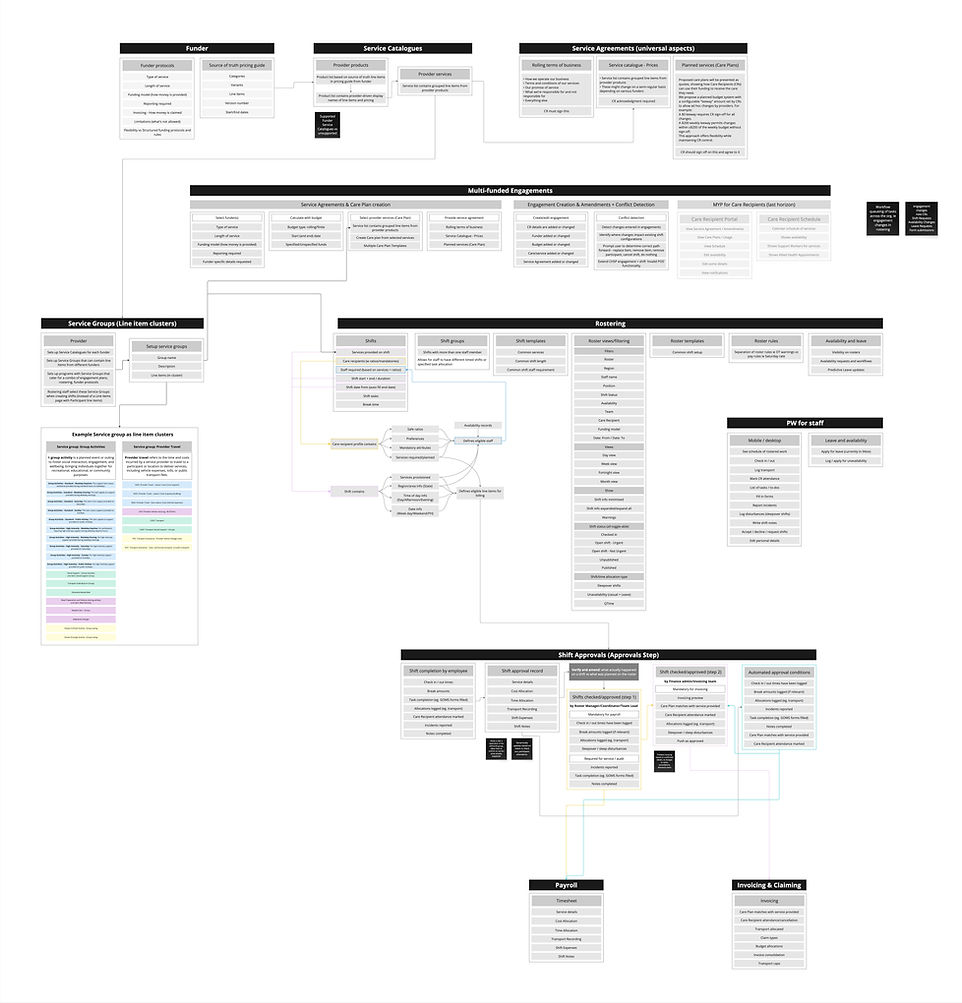
I mapped where it came from, where it travelled, who touched it, what decisions it influenced and where it caused pain in the current workflows
Forming the structures
I used low-fi maps, workflow models, system diagrams and early UI thinking to explain the direction to exec, engineering and product.
Discovering 'the journey of the line item'
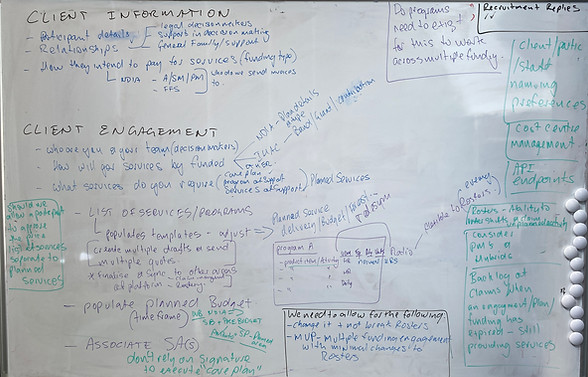
My team and I kicked off discovery with a few whiteboarding, spitballing and knowledge-sharing sessions.
By the end of the day, our CPO had flown back to Sydney and I’d finally found a way to visualise what we’d all been trying to explain. That was when my colleague and I landed on the phrase “the journey of the line item”.
It was a small but very cool moment. We had found the smallest part of a very large journey, and the key to thinking about engagements in a funding-agnostic way.


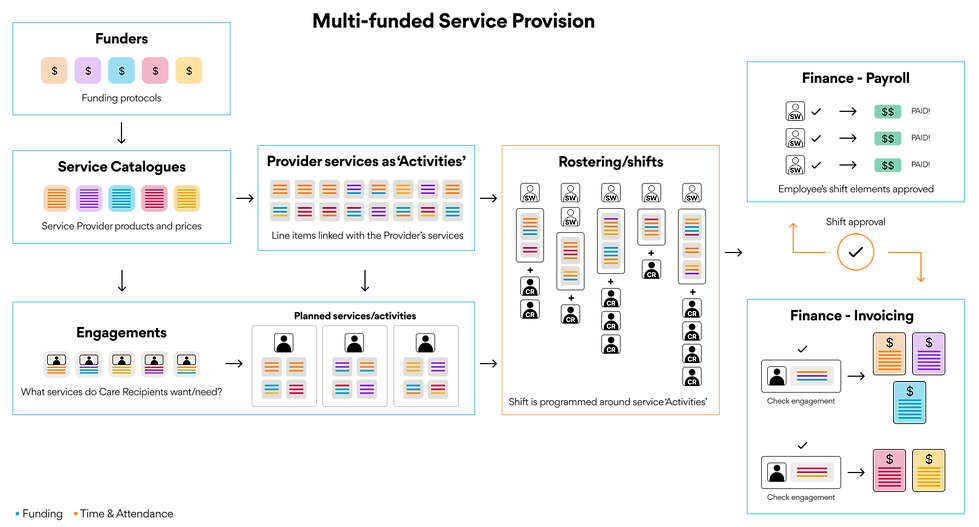
Mapping
I mapped the pieces of the structure that would be affected by the line item's journey and what surrounded those parts. It was a good move getting it all into a structure that was easy to explain to Engineering leads and BAs.
You can magnify this one
(give it a moment to load)
User understanding and JTBD
I also carried out a full user research project to understand our user personas and cohorts from broad based service providers.
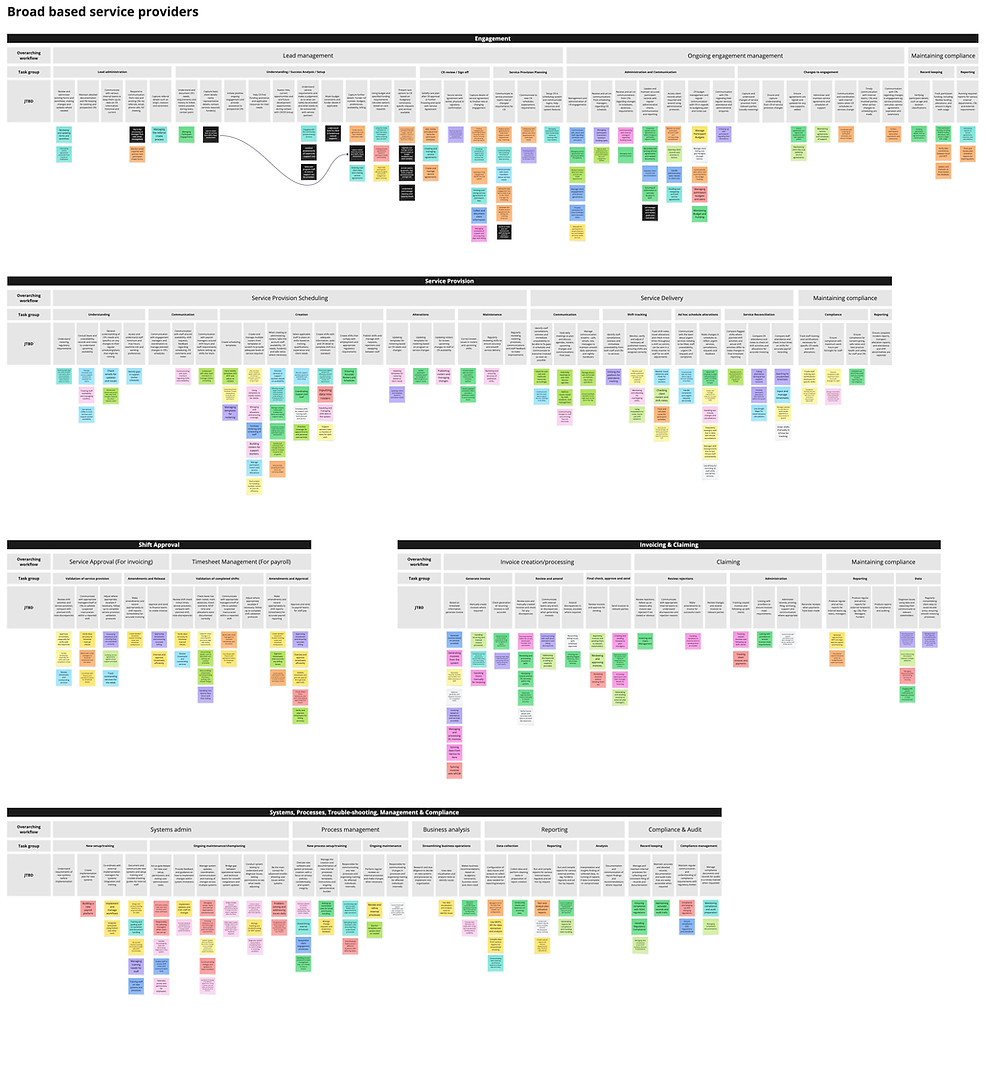
I mapped the customer jobs to be done across engagement management, service delivery, shift approvals, invoicing and claiming, and business systems reporting and compliance.

Post-its from our conversations with users; colours represent each user we talked with
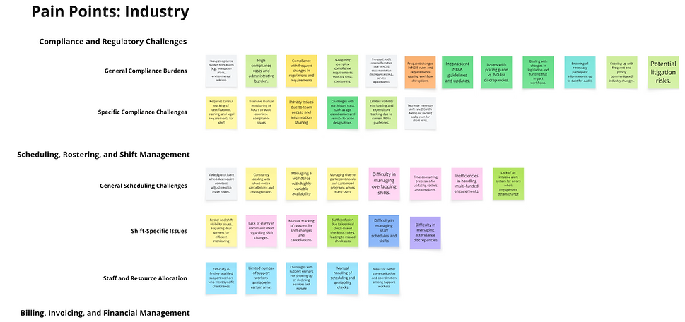

Key finding: Organisations did the same things in very different ways
The challenge to overcome this was to understand the core JTBD and compare it with the rules and regulations actually set out by the governing bodies. In some cases we needed to be opinionated on certain workflows helping educate some clients to what they could and couldn't do.
Mapping Jobs To Be Done
You can magnify this one
(give it a moment to load)
Flows and wireframes
Taking all the collected insights, I then worked towards basic diagrams, flows and low fid wireframes. These were needed to inform engineering on what to start investigations and set spikes for, as well as communicate how I was thinking about multi-funded engagements as a concept.
This was just one set of diagrams, flows and wireframes shown:



