

UPSKILL PROJECT: MÉDECINS SANS FRONTIÈRES
I spent some time training with Peak XD and for the practical part of the course work we got to spend time working with Médecins Sans Frontières (MSF) aka Doctors without Borders.
They came to Peak XD due to a lack of long term user engagement and were open to Peak leading/mentoring their students through the process of designing a better experience for their users.
Project: UX Design
Credits: Peak XD Principal and Senior Consultant Tania Lang | Peak XD Coach & Senior Consultant Miranda Wee
Stage 01: Understand
Definition of the business concerns and goals, understanding target users and the general problem space.
Stage 02: Definition
Research and analysis; looking at the problem spaces and defining what they are.
Stage 03: Development
Taking what we know from stages 1 & 2 and creating testable designs based on insights and ideation.
Stage 04: Delivery
After testing designs and making iterations, we deliver solutions and recommendations alongside physical designs.
Stage 01: Understand
Understanding the business needs
Business Problem
The MSF Australia website is not getting optimal long-term user engagement due to:
1.
Its complicated menu structure, which means visitors have trouble finding the info they want
2.
A broadcast culture which bombards visitors with information & stories that they may not be interested in
3.
Unsatisfying user experiences that are causing early abandonment & a lack of continued engagement
Business Goal: Offer a website experience that encourages ongoing active engagement, informs visitors quickly and easily, and overall is an inclusive and enjoyable site to use.
Current & Target Users

Group 01: Supporters
Ongoing supporters and One-off supporters

Group 02: Recruits
Field HR Applicants and Recruiters

Group 03: Information finders
People who are looking for stories, information & materials from MSF
FOCUS IS ON THIS GROUP
Stage 02: Definition
Research planning & analysis
Research Objectives
1.
2.
3.
How to gain more long term engagement with MSF's current and potential users and better understand their user groups
MSF wants to understand how the menu structure and IA could be improved.
Understand what parts of the home page could be improved for a better and more engaging experience of all MSF users.
Hypothesis: We believe that with a more engaging home page design, intuitive menu and simplified IA restructure current/new supporters, HR recruits and new visitors (information finders) will engage more often for longer which will result in more ongoing/long term supporters and HR sign-ups.
1
2
3
4
5
6
Research Techniques
Walk-throughs (“in the shoes”)
Interviews (Artifacts: personas + journey maps)
Competitive analysis
Chalk Mark (Interface design testing)
Card sorting (Menu items and naming)
Tree Jack (Information Architecture) testing with users
Data collection + artefacts
Our group conducted 15 interviews with a mixture of folks that fit into the User Group 1 – Supporters.
From the 3 interviews I conducted, alongside the information collected from the other 12, I created a persona and user journey.
YOU CAN ZOOM IN ON THIS ONE

YOU CAN ZOOM IN ON THIS ONE

Qualitative data:
Insights from user research
Insights are based on the common themes found, competitor research, persona walk-throughs and group collaborations
1.
2.
3.
4.
Give users a strong ‘call to action’
Display action-based imagery and human-focused story telling
Give numbers and financial figures where supporter’s donations are used
Make paid or volunteer work easy to find information on and the application process smooth
Stage 03: Development
Menu + information architecture
IA Card Sort
The group used an open card sort with about 30 participants to determine patterns around category names and where content on a website could be found.
Card Categories
Category 01: Donate/Donations/Donating/
Contributions/Donation
Category 02:
Join MSF/Join Our Team/Recruitment/Interested in joining?/Join Us/Work with us/Working for MSF
Category 03:
About Us About MSF/About Us/Countries we are working/The work we do/Coverage
Category 04:
Our work/Detailed Information re MSF Activities/News and Stories
Category 05:
News & information/Education Material & Latest News/Exposure
Category 06:
Connect With MSF/Share MSF With Others/ Giving to others/My account/Personal Profile
Menu Names
SUPPORT US
GET INVOLVED
WHO WE ARE
NEWS, STORIES & RESOURCES
CONNECT
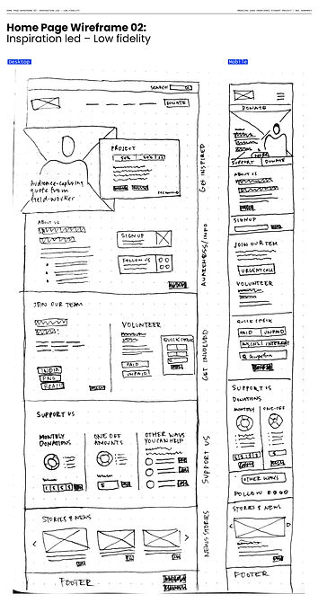
Wireframing the home page
Based on all the user research, I spent time redesigning the current home page with indicative wireframes to help show the client what my ideas were around improvement.

Stage 04: Delivery
Menu structure (proposed)
First and second level
YOU CAN ZOOM IN ON THIS ONE

Page + Link structure (proposed)
First and second level
YOU CAN ZOOM IN ON THIS ONE

Home page wireframe (proposed)
Option 02: Inspiration/Action led (Mid-fidelity)


Home page: Proposed redesign


Features that tested well in the proposed home page design
1.
A strong in-action image with positive message from on-field staff
2.
Project-specific money and people numbers
3.
Having the Donate & Work with us buttons within the call to action
4.
The downward flow from the landing into the about section
5.
Having the socials quite close to the top
6.
Calling out the urgently needed staff made users feel the need to quickly check if they could help
7.
Users liked that the donate section is below the work with us section (made it feel like less of 'money emphasis')
8.
Having other ways you can help right near the giving money part